Challenge
Cycling has passionate fans, but the game needed a brand with the same energy as a sprint to the finish line.
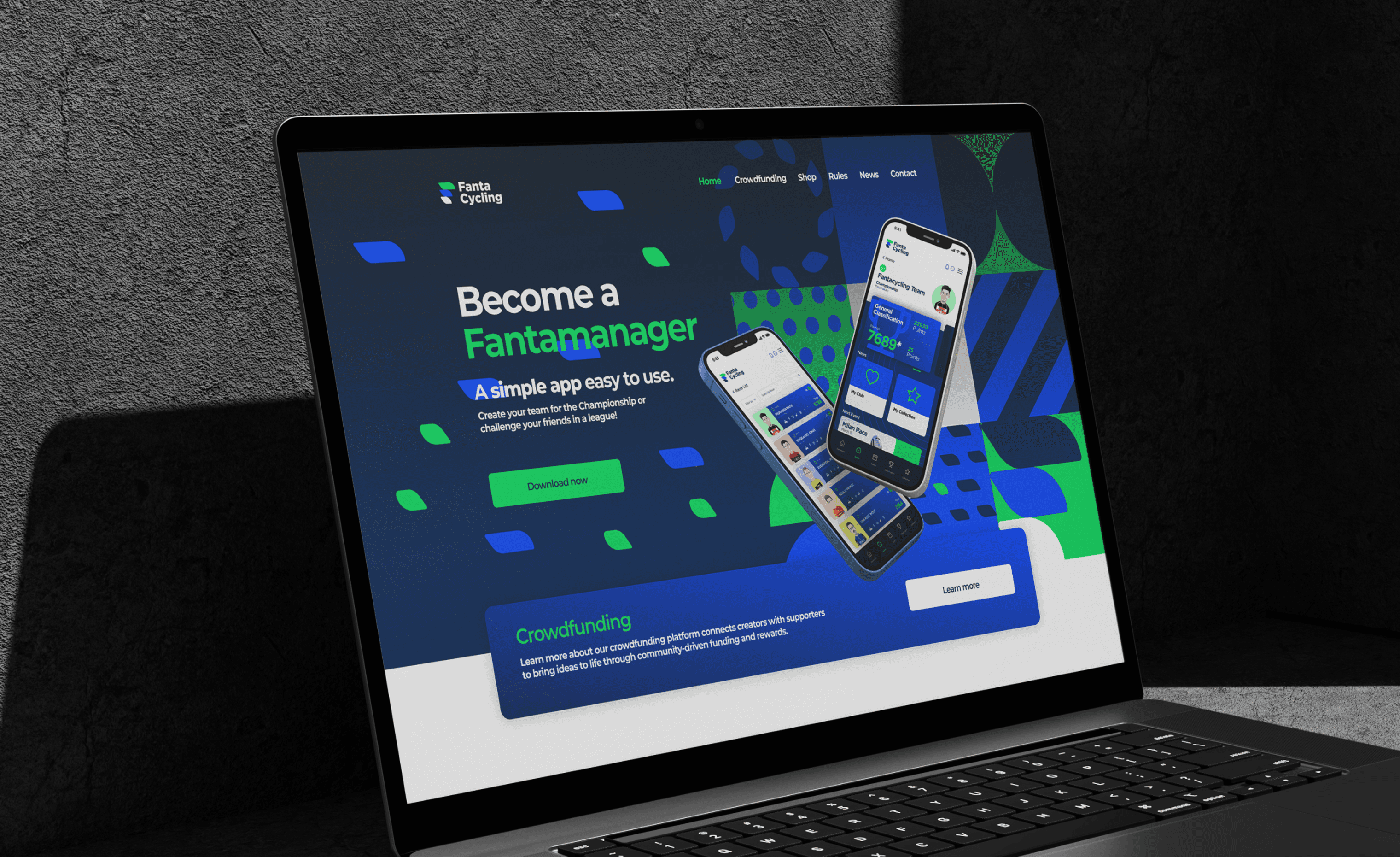
The work meant creating a visual identity that could convey speed, movement and a connection with the outdoors. It also meant designing a website and a mobile app where users can build their team, follow the race calendar and check their standing in the general classification.



Final thoughts
Fantacycling now has a brand that moves like the peloton: fast, fresh and full of energy.
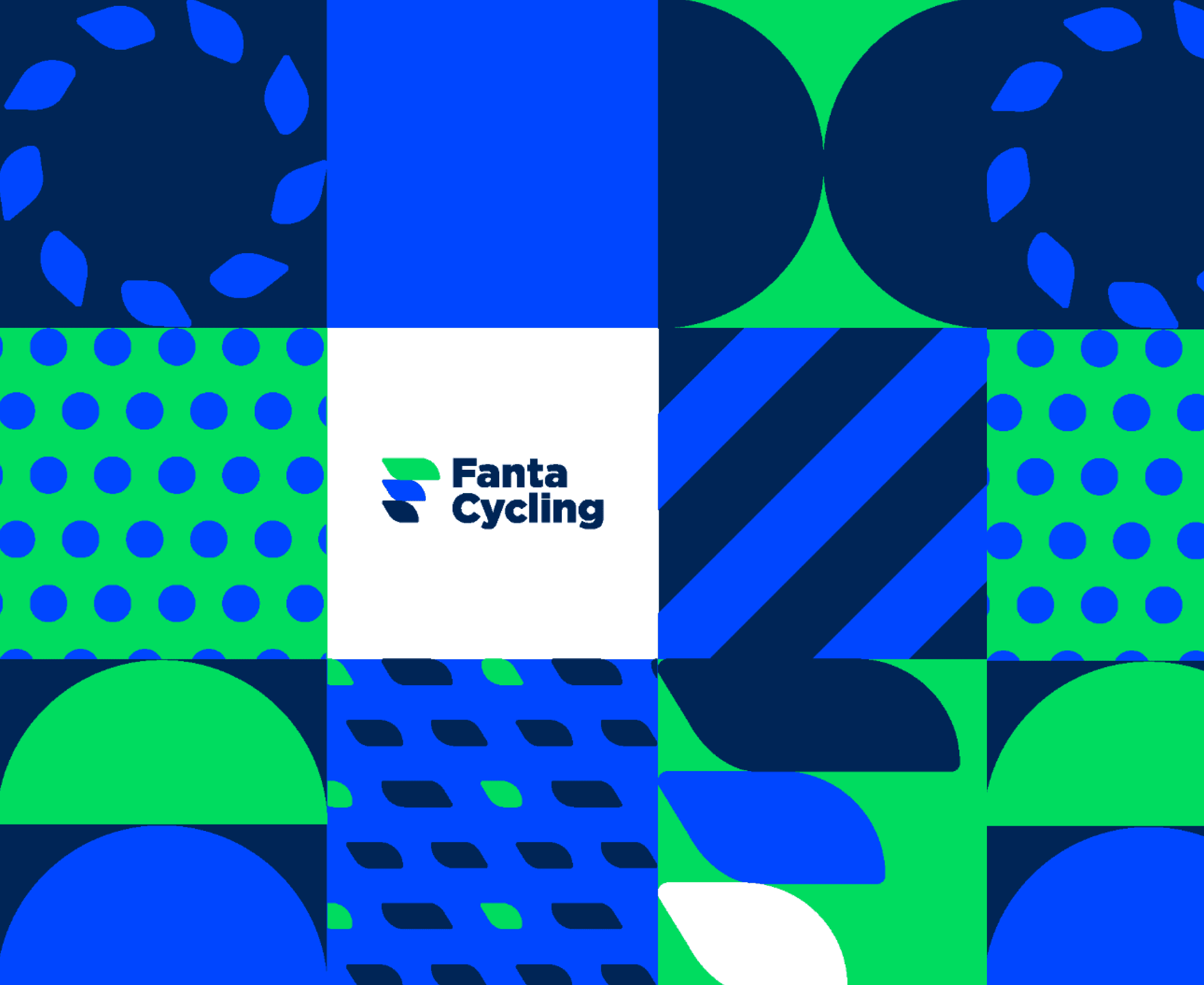
A symbol made of leaf-shaped forms, a green and blue palette and a dynamic graphic pattern come together in one system. It runs from the website and app to stationery, social media, billboards and merchandise.
Next projects.
(2016-25©)