

Challenge
Pesti helps supply chain companies stand out, but its own brand wasn't telling that story with the same strength.
The work meant a full rebrand, including the logo redesign, color palette, typography and patterns. Everything was built on the agency's three pillars: Trust, Strategy and Growth.




Final thoughts
Pesti now has a brand that markets itself, as confident and direct as the work it does for its clients.
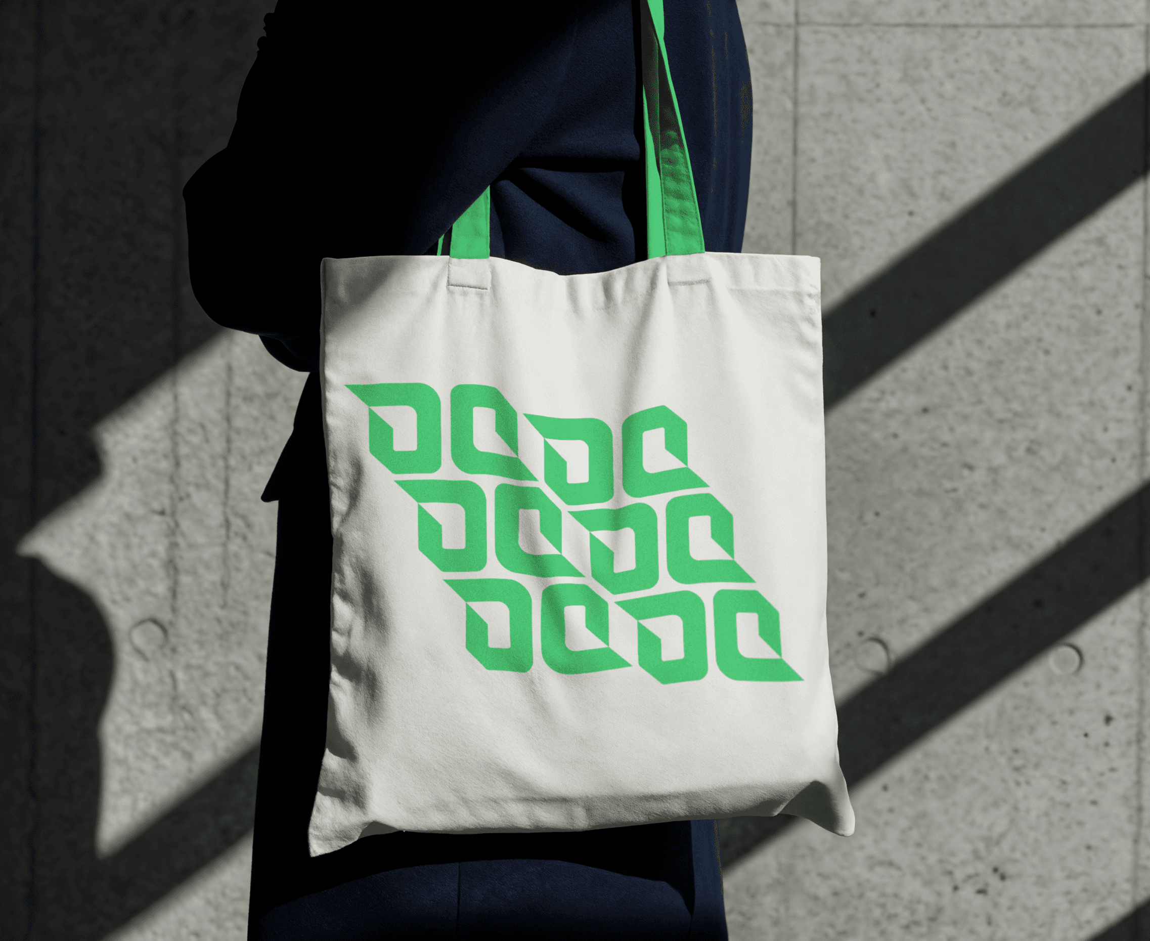
A geometric symbol built on a 4x4 grid, a vibrant green palette and a set of icons based on its pillars come together in one system. It runs from the website and social media to billboards, event stages, editorial pieces and merchandise.
Next projects.
(2016-25©)


