

Challenge
Synergy already had a strong reputation in its industry, but its brand wasn’t keeping up with the technology behind it.
The logo needed a refresh and the existing palette an update, without losing what made Synergy recognizable. The website had to clearly present the company and its two products, and a brand manual had to keep everything consistent from now on.


Final thoughts
Synergy now looks like what it is: the leader in warehouse management technology.
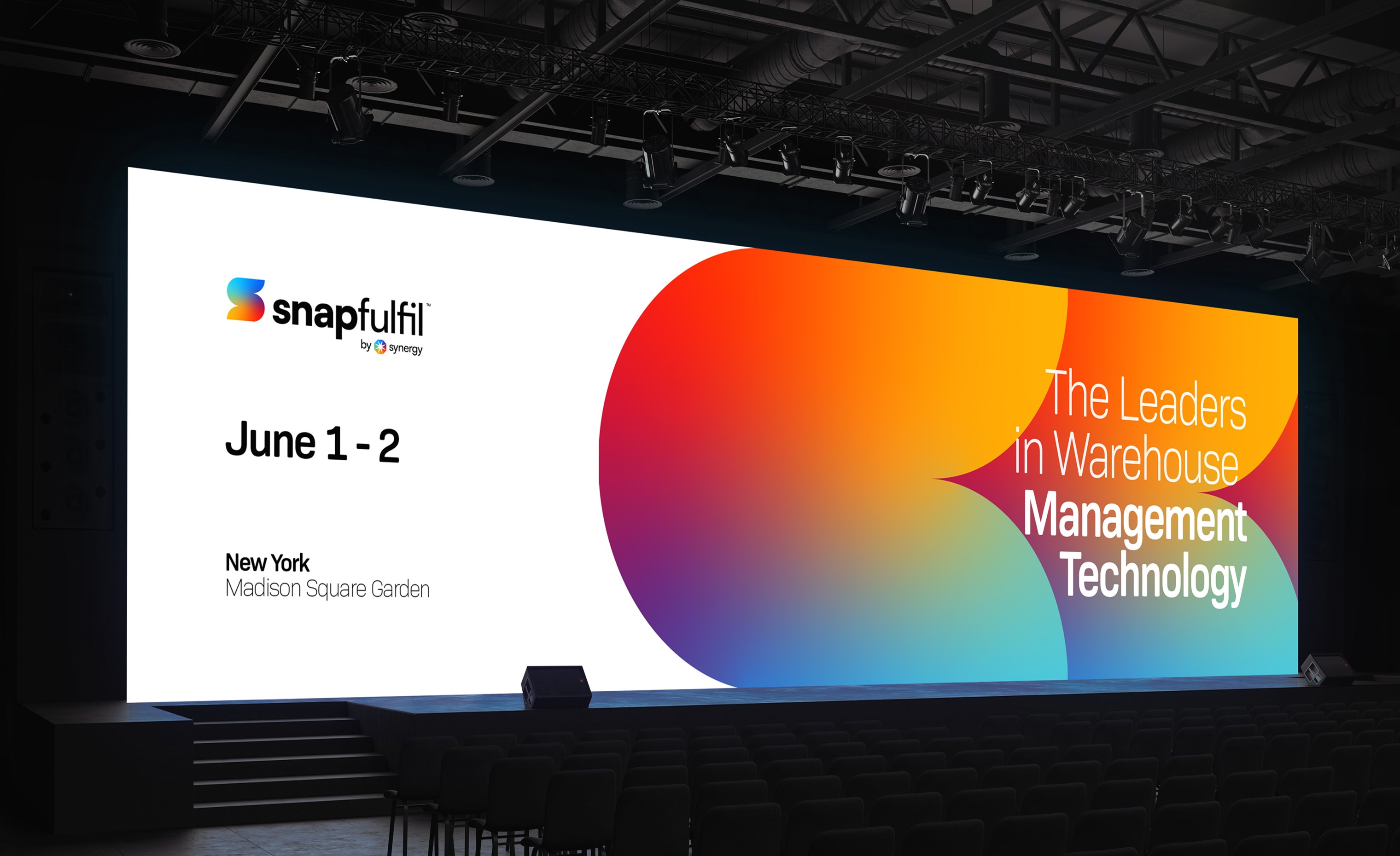
A refreshed star symbol, a vibrant gradient that runs from blue to yellow and red, a new website and a complete brand manual come together across Synergy, Snapfulfil and Orca, on screens, stationery, publications and event stages.
Next projects.
(2016-25©)


